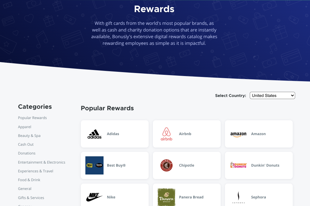
Bonusly is a fun, personal employee recognition and rewards program that enriches your company culture and improves engagement.
In early 2019, I joined the team at Bonusly as the second Product Design hire. My primary responsibilities are to own the design process from end to end while partnering with Engineers, Product Owners, and Business stakeholders. I coordinated and facilitated user testing and research with current users . I represented design on the Product Steering Committee and worked with Senior leadership and executives to plan the product roadmap. Additionally, I lead hiring to grow the team to grow the team to 3 designers.
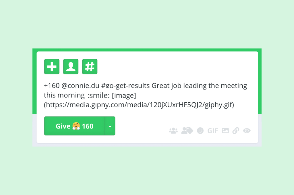
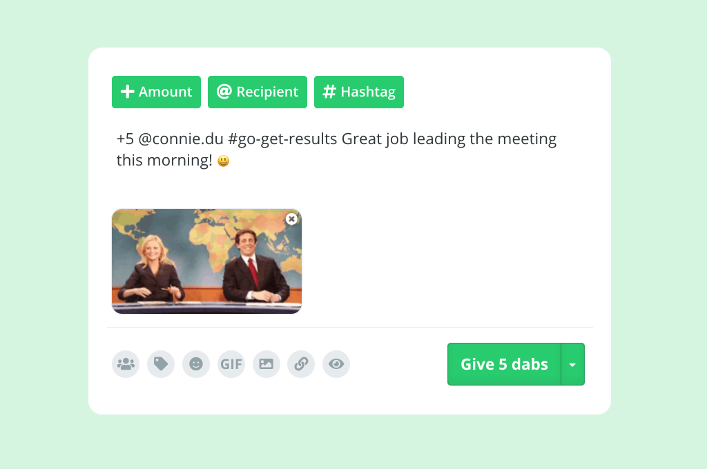
One of the first features that I worked on was a redesign of the Give Box, which is the most central part of the Bonusly app UI. Previously markdown was used to add links, images, and emojis. This was was messy and hard for the user to preview. We had also recieved feedback from users and from heatmap testing that the Give button being on the left side was confusing for users. After some prototypes and testing of different concepts, we landed on a design that moved the Give button to the right (following general design patterns for submit buttons), adding inline previews for images, emojis, and GIFs, we added descriptions to the buttons UI buttons in the top left, and we added inline previews of GIFs and images. Lastly, we added a gray background to the post buttons to let them stand out and not appear disabled.
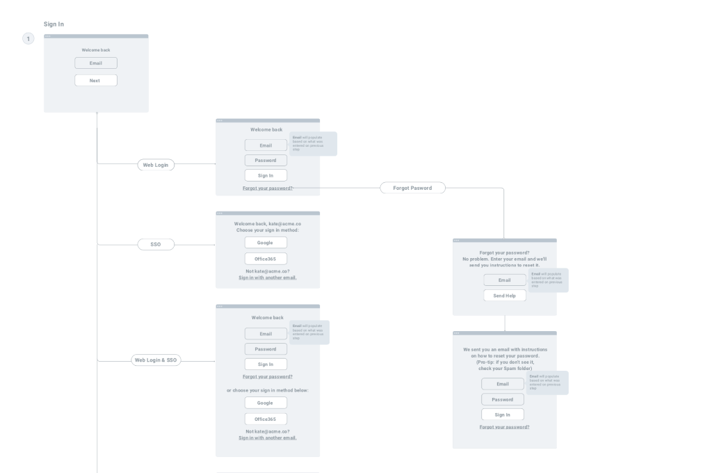
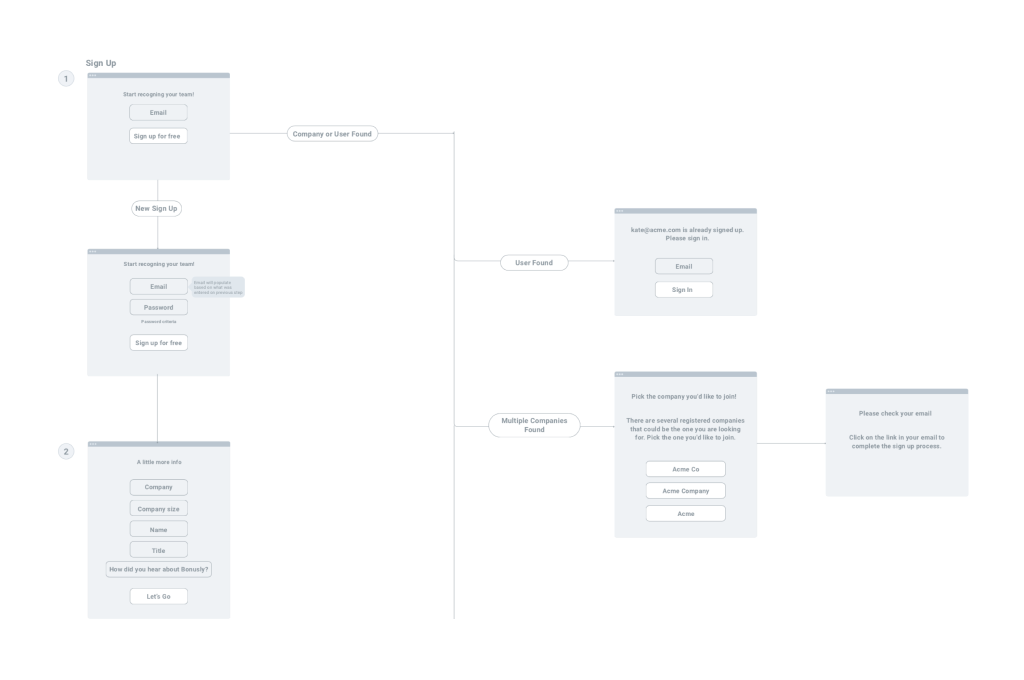
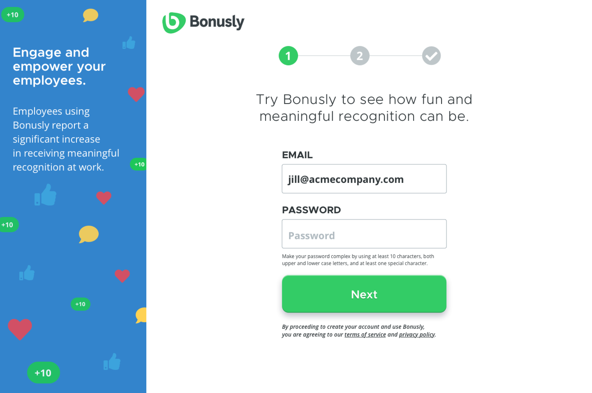
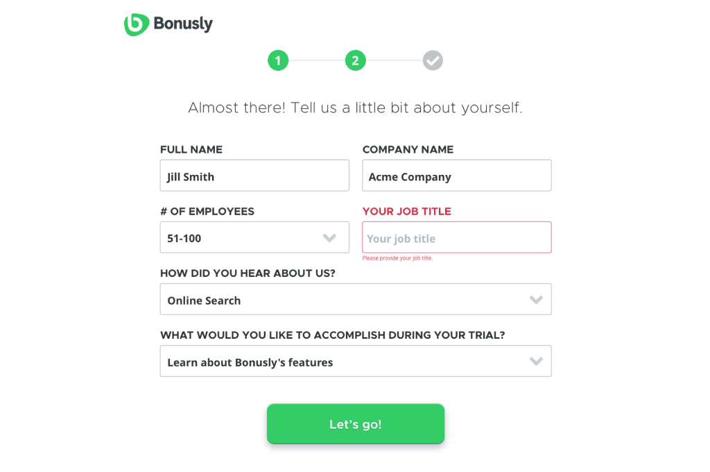
One of the next areas of the app that I worked on was a complete overhaul of the user experience and user interface for how people sign up and sign in of the app. Initially, this scope of the project only covered the sign up flow, but after user interviews and research (conducted using the Full Story app), we decided the sign in process was also in need of an overhaul. Additionally, updating both flows at the same time allowed us to make the UI consistent across the app. The old sign up experience required the user to go through 7 different steps (7 page loads!) and the new experience cut that down to 2 (or 3 based on if they are an Enterprise customer). The old UI was stylistically very different from the Bonusly app experience and we wanted to introduce UI elements and themes in the onboarding process that would then be familiar to the user once they began using the app. We also incorporated more of Bonusly's brand and personality during the redesign. We have seen very positive results with these changes and have recieved feedback that the streamlined process is much easier to use.
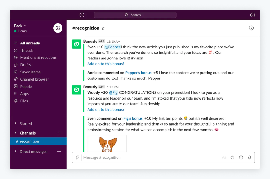
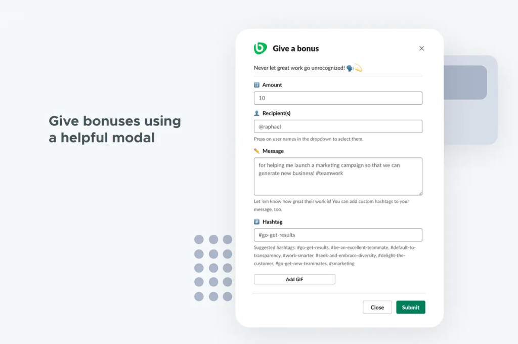
My team did a redesign of our Bonusly Slack Integration. Previously, our Slack Integration was a slash command "/give" which was limited in features and also required the user to use markup. The new Bonusly for Slack guides users through the Giving interaction in a modal and makes it easy to add a GIF to bonuses. We were able to utilize Slack's Block Kit tool to prototype and test different interactions during the design process. Bonusly for Slack was recently featured on Product Hunt and in the Slack marketplace.